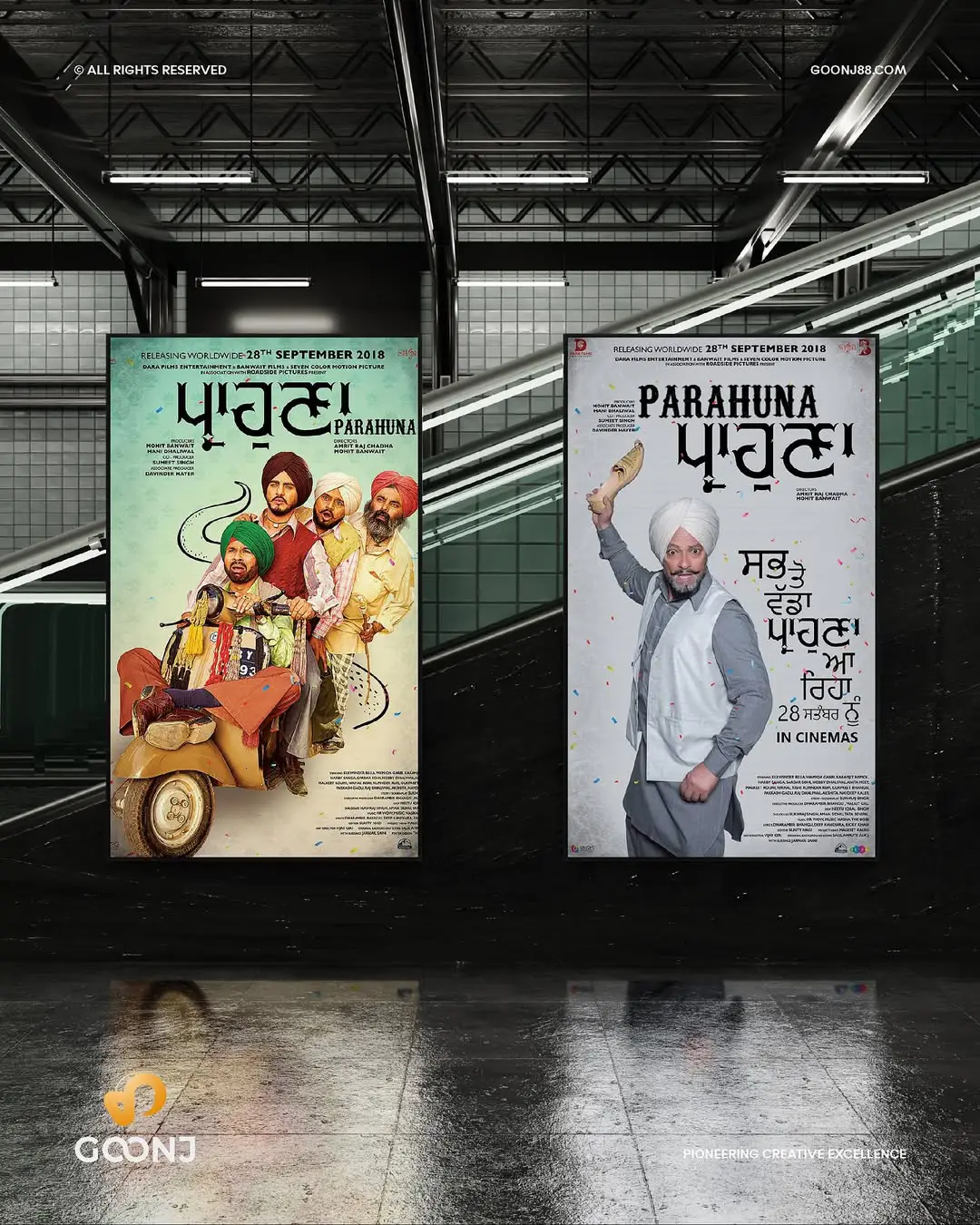
When you see a vibrant music poster for a rock concert or a moody movie poster for a thriller, the colors instantly grab your attention. At Goonj88, a Canada-based design service specializing in music and movie posters, we understand that colors do more than just look pretty—they tell a story, evoke emotions, and influence decisions. Color psychology plays a pivotal role in creating posters that connect with audiences, whether they’re fans in Toronto or Vancouver. In this blog, we explore how strategic color choices can make your posters unforgettable, ensuring they stand out in a crowded creative landscape.
Why Color Psychology Matters in Poster Design
Colors have the power to shape perceptions and trigger emotions. A well-designed poster uses this to its advantage, aligning hues with the mood of a music event or film. For instance, a poster for a lively music festival in Canada might use bright oranges to convey energy, while a drama film poster could lean on deep blues to suggest introspection. At Goonj88, we carefully select colors to reflect the essence of your project, ensuring, ensuring the poster resonates with your target audience, whether it’s for a local band in Calgary or a film premiere in Montreal.
Understanding color psychology helps designers avoid missteps. Using overly aggressive reds for a romantic movie poster might confuse viewers, while soft pastels for a heavy metal concert could dilute the event’s intensity. By applying color theory, Goonj88 crafts posters that feel authentic and impactful, helping your project shine in Canada’s vibrant arts scene.
Choosing Colors for Music Posters
Music posters need to capture the vibe of the artist or event. Here’s how Goonj88 uses color psychology to create compelling designs:
- Energetic Genres (Pop, EDM, Rock): Bright colors like red, yellow, and orange evoke excitement and movement. For a summer music festival in British Columbia, we might use sunny yellows paired with electric blues to mirror the lively atmosphere.
- Soulful Genres (Jazz, Blues, Folk): Earthy tones like warm browns, deep greens, or soft purples create a cozy, intimate feel. A jazz night poster in Ottawa could feature muted purples and golds to evoke sophistication.
- Edgy Genres (Punk, Metal): Bold contrasts, like black with neon accents (pink, green), scream rebellion. For a punk gig in Vancouver, Goonj88 might use stark black backgrounds with vibrant green text to grab attention.
By tailoring colors to the genre, we ensure the poster speaks directly to the fanbase, making it a must-have keepsake.
Crafting Movie Posters with Color
Movie posters need to distill a film’s story into a single image, and color sets the tone. Goonj88 designs posters that align with a film’s genre and narrative:
- Thrillers and Horror: Dark colors like black, deep red, or charcoal gray create tension. A horror film poster might use blood-red accents against a shadowy background to hint at suspense without revealing too much.
- Romantic Films: Soft pinks, corals, and creams evoke warmth and connection. For a rom-com set in Quebec, we might use blush tones with golden highlights to feel inviting.
- Sci-Fi and Fantasy: Metallics, neon blues, and purples suggest otherworldly vibes. A sci-fi epic could feature icy blues and silvers to evoke futuristic themes, perfect for a premiere in Edmonton.
These choices help viewers instantly grasp the film’s mood, enticing them to buy tickets.
Cultural and Regional Considerations
Canada’s diverse cultural landscape influences color choices. At Goonj88, we consider local aesthetics to make posters feel personal. For example, a music poster for an Indigenous artist in Manitoba might incorporate earthy reds and turquoises, reflecting cultural symbolism. Similarly, a film poster for a French-Canadian production in Montreal could use elegant blues and whites, nodding to Quebec’s heritage. By blending color psychology with regional context, we create designs that feel authentic and inclusive.
Practical Tips for Using Color Effectively
To make your posters pop, Goonj88 follows these principles:
- Balance Hues: Use a primary color (60%), a secondary color (30%), and an accent (10%) to create harmony. For a Toronto concert poster, we might use blue as the base, white for contrast, and yellow for highlights.
- Ensure Readability: High-contrast colors (e.g., white text on a dark background) make details like event dates or film titles clear. Low contrast can work for artistic effects but risks losing impact.
- Test for Accessibility: Consider colorblind audiences by avoiding problematic combos like red-green. Tools like contrast checkers help us ensure inclusivity.
- Reflect the Brand: If an artist or studio has a signature palette, we weave it into the design. A band with a bold red logo might inspire a poster with red accents, reinforcing their identity.
These strategies ensure your poster is both beautiful and functional, grabbing attention at a glance.
Why Choose Goonj88 for Your Poster Design?
At Goonj88, we combine color psychology with creative expertise to craft posters that leave a lasting impression. Based in Canada, we understand the local music and film scenes, from indie gigs in Halifax to blockbuster releases in Toronto. Our designs are tailored to your vision, using colors that resonate with your audience and amplify your project’s message. Whether you’re a musician or filmmaker, we’re here to make your poster a work of art.
Ready to create a poster that captivates? Contact Goonj88 today and let’s bring your vision to life with the perfect palette.

