
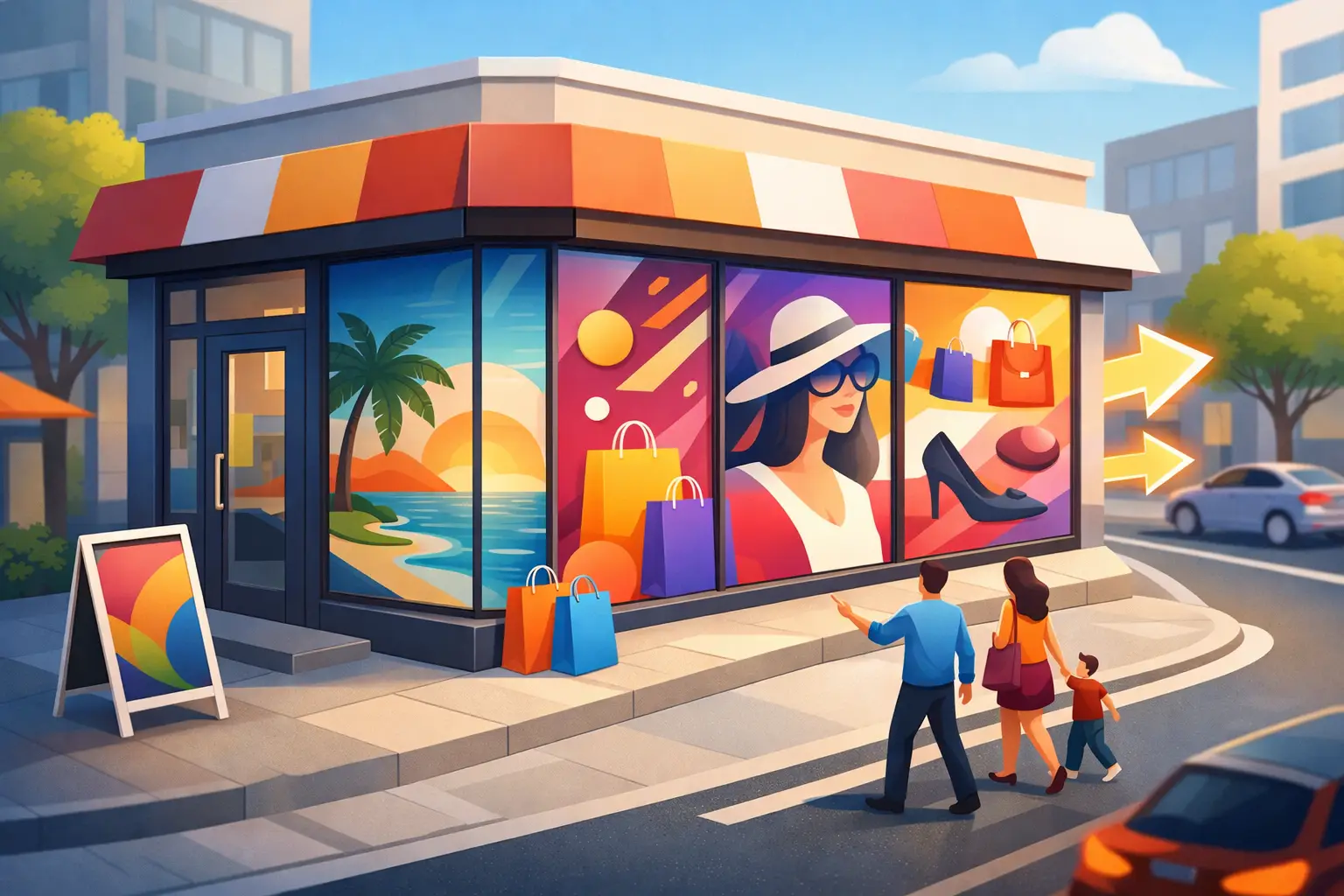
A passerby gives your storefront only a few seconds before deciding whether to walk in, keep moving, or search for another option. Window graphics for storefronts turn that split-second decision into a brand moment, a promotion, or a direct reason to take action. The glass outside your business is not empty space. It is sales space that works before your team says a word.
For local businesses, retail shops, clinics, restaurants, salons, offices, and event-driven brands, the right window display can build recognition, communicate an offer, and make the location easier to trust. The wrong one can make a business look cluttered, dated, or hard to understand. Strong storefront graphics are not decoration alone. They are physical advertising designed to move people from the sidewalk to the door.
Why Window Graphics for Storefronts Matter
Digital ads can put your business in front of the right audience online. Window graphics catch the people who are already nearby, already mobile, and often already looking for a solution. That makes them especially valuable for businesses that depend on walk-ins, local visibility, appointments, or neighborhood recognition.
A clean, strategically designed window can answer the questions customers ask silently: What do you sell? Is this business open? Is this for me? Is there a promotion worth acting on? Can I trust this brand? When those answers are visible from a distance, your storefront starts doing more of the selling work.
This is where execution matters. A premium service can lose credibility behind faded vinyl, inconsistent colors, tiny text, or a crowded layout. On the other hand, a clear graphic system can make a small local operation look established, organized, and ready for business. That visual confidence affects first impressions before price, service, or product quality ever enter the conversation.
Start With One Clear Storefront Goal
The strongest storefront window graphics do not try to say everything. They prioritize the one message that has the highest commercial value right now. That message may change with the season, the business cycle, or a specific campaign.
For a new business, the priority may be name recognition and a simple description of what you offer. For an established service business, it may be booking appointments or highlighting a high-margin service. For retail, it could be a seasonal collection, limited-time offer, or new arrival. For a restaurant, it may be a visual cue that makes people hungry before they reach the menu.
Before design begins, decide what success looks like. Do you need more walk-ins, calls, online orders, event registrations, or awareness in a new neighborhood? A window campaign aimed at driving appointments should include a visible call to action and easy contact path. A brand-awareness installation may benefit more from bold visuals, a memorable logo, and a short positioning statement.
Trying to fit your full menu, service catalog, brand story, operating history, and five offers on one pane usually produces a message no one reads. One primary message, one supporting point, and one clear action will outperform a wall of information.
Choose the Right Material for the Job
Material selection affects visibility, privacy, durability, installation, and cost. It should follow the intended purpose of the window, not simply the lowest price.
Perforated window film is popular when you want a full-color graphic on the exterior while keeping some visibility from inside. It works well for retail promotions, branded imagery, and large visual campaigns. However, its see-through effect can be reduced at night when interior lighting is brighter than outside, so it is not always the best choice for every location.
Opaque vinyl delivers bold, solid color and high readability. It is a strong option for logos, text, hours, directional messages, and graphics that need maximum contrast. Because it blocks visibility where applied, it is often best used as selective design elements rather than covering an entire customer-facing window.
Frosted or etched film creates a polished, upscale look while adding privacy. Medical offices, salons, professional services, and studios often use it to define spaces without making the storefront feel closed off. It is especially effective for subtle logos, patterns, and privacy bands.
Static cling graphics are designed for shorter promotions and frequent changes. They can be useful for sales, holiday campaigns, or temporary announcements, though they are generally less durable than adhesive vinyl. If your marketing calendar changes often, planning for reusable or easy-to-replace graphics can protect your budget.
Cut vinyl lettering remains one of the most practical choices for permanent essentials such as business name, hours, phone number, website, and service categories. It is clean, cost-effective, and easy to layer into a broader storefront system.
The right choice depends on how much natural light you need, whether privacy matters, how often the offer changes, and how long the graphic needs to last. A lower-cost material is not a bargain if it fades, peels, or limits the customer experience inside your space.
Design for Distance, Not Just for the Screen
A graphic can look impressive on a laptop and fail completely from the street. Storefront design must be evaluated at real viewing distances, from across the parking lot, down the sidewalk, and directly in front of the door.
Start with hierarchy. Your business name or campaign headline should be the easiest element to spot. The second layer should tell viewers what you offer or why they should care. Details such as phone numbers, QR codes, hours, and disclaimers belong lower in the hierarchy, where interested customers can read them up close.
Contrast is non-negotiable. Light gray lettering on a clear window may look minimal but can disappear against reflections, parked cars, weather, and changing daylight. High-contrast color combinations are easier to read and typically perform better in real-world conditions. Your brand palette should guide the design, but readability has to win when the two conflict.
Typography also needs restraint. Use fonts that remain legible at a glance. Script typefaces, condensed lettering, and thin strokes may work for a logo, but they are rarely the right choice for a storefront headline. Keep the copy short enough to scan in motion. People walking or driving by are not stopping to decode a paragraph.
Photography and product imagery can be powerful, especially for food, fashion, fitness, beauty, and lifestyle brands. But low-resolution images will look worse when enlarged. Professional production requires artwork built to the correct scale, with adequate resolution and safe margins for trim, frames, handles, and window seams.
Make Promotions Feel Current Without Replacing Everything
A storefront should not look frozen in time. If customers see the same graphics year after year, they may assume nothing new is happening inside. That does not mean you need to replace every window graphic every month.
Build a layered system. Keep the foundational elements stable: logo, brand colors, core services, hours, and permanent privacy treatments. Then reserve a defined section of glass for campaign messaging. This allows you to promote a seasonal offer, new product, hiring push, special event, or local partnership without redesigning the entire storefront.
For example, a fitness studio might maintain frosted brand graphics and service identifiers while rotating a front-window offer for a trial class or membership incentive. A retail business can hold a consistent logo and visual style while changing product imagery and sale messaging by season. The result is a storefront that stays recognizable but never feels stale.
Time-sensitive graphics work best when the offer is specific. “Big Sale” is weak because it gives no reason to act now. “20% Off Summer Styles Through Sunday” provides a clear benefit and deadline. The offer must also be operationally real. If the window promises a deal your staff cannot explain or honor, the graphic creates friction instead of trust.
Connect Physical Visibility to Your Marketing System
Storefront graphics should support the rest of your marketing, not operate as a separate design project. The colors, offer, language, and visual style should align with your website, social campaigns, paid ads, direct mail, and in-store materials. Repetition makes a campaign easier to recognize and easier to remember.
QR codes can bridge the physical and digital experience when used thoughtfully. A code may lead to a booking page, menu, promotion, event registration, or product catalog. But it should support a clear reason to scan. A code by itself is not a call to action. Pair it with a concise benefit such as “Scan for this week’s offer” or “Book your consultation in minutes.”
You can also use window campaigns to test messaging before expanding it into paid media. If a headline consistently gets customer questions, walk-ins, or scan activity, it may be a strong candidate for ad creative. If nobody responds, you have learned something without committing a large media budget.
That integrated approach is where a creative growth partner can add real value. Goonj88 can align storefront production with your wider brand and campaign strategy, so your physical location reinforces the same message customers see online.
Avoid the Mistakes That Cost Attention
The most common mistake is visual overload. Too many colors, competing typefaces, small logos, excessive service lists, and multiple calls to action create a storefront people ignore. A second mistake is treating every window the same. Street-facing glass, side windows, entrance doors, interior partitions, and windows near checkout areas each have different visibility and functional needs.
Installation quality matters just as much as design quality. Bubbles, crooked alignment, poorly cut edges, and graphics placed over damaged glass undermine the brand. Measure precisely, account for handles and frames, and use professional installation for large or permanent applications. Also check local signage rules, landlord requirements, and any restrictions for historic districts or commercial plazas before production.
Finally, maintain what you install. Clean the glass with appropriate products, replace damaged sections quickly, and remove expired promotions. A window announcing a sale from last season tells customers your business is not paying attention.
Your storefront gets noticed every day by people already in your market. Give them a message worth noticing, a reason to step closer, and a visual experience that makes your business feel ready for what comes next.